

Your website might be driving away more customers than you realize. With over 60% of web traffic now coming from mobile devices, businesses can't afford to ignore the mobile experience. Yet most websites still fail to deliver what mobile users need, resulting in lost sales, frustrated customers, and diminished search rankings.
The harsh reality? If your website isn't mobile-optimized, you're essentially turning away the majority of your potential customers before they even see what you offer.
The Mobile-First World We Live In
Mobile devices now account for 62.54% of global web traffic, with desktop trailing at just 35.69%. This isn't a trend: it's the new baseline. Your customers are browsing, researching, and buying from their phones and tablets more than ever before.
What makes this shift even more critical is user behavior. Mobile users are impatient and have zero tolerance for friction. They expect instant access to information, seamless navigation, and fast-loading pages. When they don't get it, they leave: often within seconds.

The numbers tell the story clearly: mobile bounce rates consistently run 8-12 percentage points higher than desktop. For a website receiving 10,000 monthly visitors, that difference represents hundreds of potential customers walking away before engaging with your business.
The Speed Trap That Kills Conversions
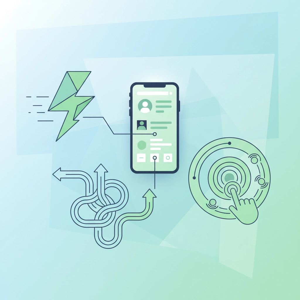
Here's the biggest mobile killer: slow loading times. A staggering 53% of mobile users abandon websites that take longer than 3 seconds to load. Three seconds. That's barely enough time to take a breath.
Consider what this means for your business. If your website takes 5-6 seconds to load on mobile: which many still do: you're losing over half your potential customers before they see a single word of your content.
The flip side is equally compelling. Businesses that improve their mobile load times from 8 seconds to 2 seconds see conversion increases of up to 74%. Speed isn't just about user experience: it's directly tied to your bottom line.
Common Mobile Design Failures
Most mobile website problems fall into predictable categories that frustrate users and drive them away:
Tiny Text and Buttons
Websites designed for desktop often shrink down awkwardly on mobile screens. Users shouldn't need to pinch and zoom to read your content or struggle to tap tiny buttons with their fingertips.
Broken Navigation
Complex desktop menus often become unusable on mobile devices. Dropdown menus that don't work, hidden navigation options, and confusing menu structures create immediate friction.
Poor Layout and Spacing
Content that overlaps, text that runs off the screen, and cluttered layouts make it impossible for mobile users to focus on what matters.

Unoptimized Images
Large, uncompressed images slow down loading times dramatically on mobile connections. Users won't wait for your high-resolution photos to load when they're browsing on cellular data.
The Hidden Costs of Poor Mobile Experience
Poor mobile optimization doesn't just affect user experience: it impacts your business in measurable ways:
Search Engine Penalties
Google uses mobile-first indexing, meaning your search rankings are primarily based on your mobile site's performance. A slow or poorly designed mobile site gets buried in search results, making it harder for new customers to find you.
Lost Revenue Opportunities
Over 70% of mobile users abandon shopping carts when the mobile checkout process is clunky or confusing. Even service-based businesses lose leads when contact forms are difficult to complete on mobile devices.
Damaged Brand Perception
88% of users are less likely to return to a website after a negative mobile experience. First impressions matter, and a poor mobile experience can permanently damage how potential customers perceive your business.

Competitive Disadvantage
While your website frustrates mobile users, your competitors with mobile-optimized sites are capturing those customers. In competitive markets like Venice, FL, this can be the difference between growth and stagnation.
Warning Signs Your Website Is Scaring Away Mobile Users
How do you know if your website has mobile problems? Look for these red flags:
- High bounce rates on mobile traffic compared to desktop
- Lower conversion rates from mobile visitors
- Complaints about website usability from customers
- Poor mobile scores in Google's PageSpeed Insights tool
- Declining search rankings despite good desktop performance
You can quickly test your own website by visiting it on your smartphone. If you find yourself pinching to zoom, struggling to navigate, or waiting for pages to load, your customers are experiencing the same frustrations.
What Mobile Users Actually Want
Successful mobile websites share common characteristics that keep users engaged:
Fast Loading Times
Pages should load in under 3 seconds, preferably under 2 seconds. This requires optimized images, clean code, and reliable hosting.
Thumb-Friendly Design
Buttons and links should be large enough to tap easily with a thumb. Navigation should be intuitive and accessible without precise finger positioning.
Simplified Content
Mobile users scan content quickly. Important information should be easy to find, with clear headings and concise text that gets to the point.

Streamlined Processes
Whether it's making a purchase, filling out a contact form, or finding business information, every process should require minimal steps and effort.
The Venice Advantage: Local Mobile Optimization
For businesses in Venice, FL, mobile optimization carries extra importance. Local customers often search for services on their phones while out and about. They might be looking for a restaurant, contractor, or service provider while they're already in the area.
A mobile-optimized website with clear contact information, easy-to-find business hours, and simple navigation can capture these "on-the-go" customers that competitors with poor mobile sites miss entirely.
Local search behavior is predominantly mobile, and Google's local search algorithms heavily favor mobile-friendly websites when showing results to nearby customers.
Taking Action on Mobile Optimization
The solution isn't complicated, but it requires systematic attention to mobile user needs. Professional responsive web design ensures your website adapts seamlessly to any screen size while maintaining fast loading times and intuitive navigation.
Key improvements include:
- Implementing responsive design that works across all devices
- Optimizing images and code for faster loading
- Simplifying navigation and improving button sizes
- Streamlining forms and conversion processes
- Testing regularly on actual mobile devices
The Bottom Line
Your website is either helping or hurting your mobile customers: there's no middle ground. With mobile traffic dominating web usage, businesses that ignore mobile optimization are essentially choosing to turn away the majority of their potential customers.
The good news? Once you address mobile issues, the results are immediate and measurable. Mobile-optimized websites see higher engagement, better conversion rates, improved search rankings, and ultimately more business.
Don't let a poor mobile experience be the reason customers choose your competitors. In today's mobile-first world, your website's mobile performance might be the most important factor in your business's online success.


