

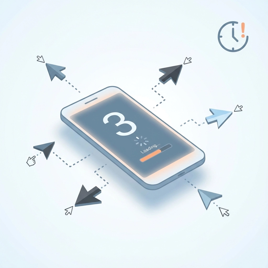
Your website has exactly 3 seconds to make a first impression. That's it. In those critical moments, potential customers in Venice are deciding whether to stay and explore your business or bounce straight to your competitors.
The harsh reality? Most websites fail this test spectacularly. When 60% of mobile searches now drive local business discovery, your mobile experience isn't just important: it's everything. Yet most Venice businesses are still stuck in desktop-first thinking, wondering why their phones aren't ringing and their foot traffic has dried up.
The 3-Second Rule That's Crushing Venice Businesses
Mobile users are ruthless. They've been trained by apps like Instagram, TikTok, and Google to expect instant gratification. When they tap on your website from a Google search and encounter a slow, clunky, or confusing experience, they're gone before your logo even loads.
Here's what happens in those first 3 seconds:
- Second 1: Page starts loading, user judges visual appeal
- Second 2: User scans for key information (hours, location, services)
- Second 3: User either engages or hits the back button
Miss any of these checkpoints and you've lost them forever. Studies show that 88% of users won't return to a website after a bad mobile experience. In a competitive market like Venice, that's a death sentence.
Mobile-First vs. Mobile-Last: The Critical Difference
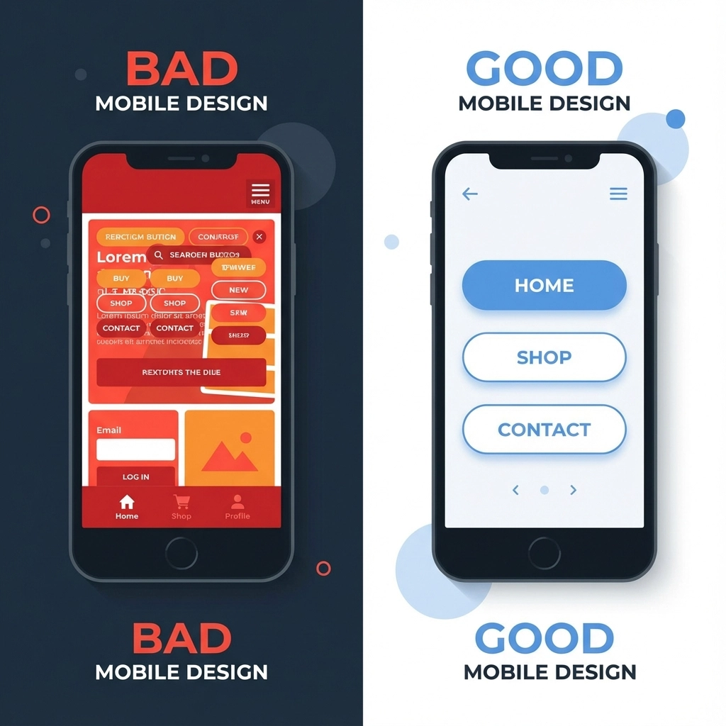
Most Venice businesses approach mobile design backward. They build a beautiful desktop website, then try to squeeze everything onto a phone screen. This "mobile-last" approach creates exactly the problems that drive customers away.
Mobile-Last Design (The Wrong Way)
- Starts with desktop layout
- Shrinks content to fit smaller screens
- Hides navigation behind hamburger menus
- Creates tiny, hard-to-tap buttons
- Results in horizontal scrolling and pinch-to-zoom frustration
Mobile-First Design (The Right Way)
- Begins with smartphone constraints
- Prioritizes essential information
- Creates thumb-friendly navigation
- Designs for touch interactions from day one
- Scales up beautifully to larger screens
The difference isn't just technical: it's philosophical. Mobile-first forces you to think like your customers, who are searching for your Venice restaurant while walking down Venice Avenue, or looking for your HVAC services while dealing with a broken air conditioner.
Why Venice Customers Abandon Sites So Quickly
1. Information Hierarchy Disasters
When someone searches "Venice FL restaurants" on their phone, they want to see three things immediately:
- Where you are
- When you're open
- What type of food you serve
Instead, most restaurant websites lead with full-screen hero videos, lengthy "About Us" stories, or complex navigation menus. By the time users find basic information, they've already chosen your competitor down the street.
2. Touch Interface Failures
Desktop mice are precise. Fingers are not. Yet most responsive websites still use:
- Menu items spaced too closely together
- Buttons smaller than 44 pixels (Google's minimum recommendation)
- Navigation links that require multiple taps
- Forms with tiny input fields
When a potential customer can't easily tap your phone number or find your hours, they move on.
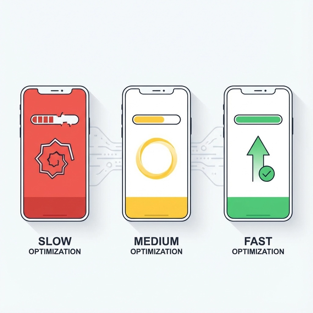
3. Speed That Kills Conversions
Venice customers aren't patient. They're often:
- Driving around looking for services
- Dealing with immediate problems (broken AC, plumbing emergency)
- Comparing multiple options quickly
Every extra second of load time costs conversions. A site that takes 5 seconds to load loses over 50% of potential customers before they see any content.
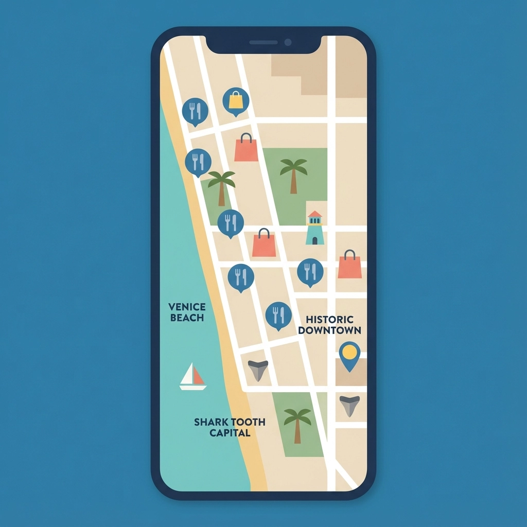
4. Local Context Ignorance
Venice has unique characteristics that mobile-first design should address:
- Tourists need clear directions and parking information
- Seasonal residents return after months away and need updated hours
- Retirees may need larger text and simpler navigation
- Beach visitors need quick access to amenities and services
Generic responsive templates ignore these local user behaviors entirely.
The Venice Mobile Advantage: Capturing "Moment of Need" Traffic
Venice businesses that nail mobile-first design capture customers at their moment of highest intent. Consider these scenarios:
The Tourist Emergency: Visitor's car breaks down on US-41. They search "auto repair Venice FL" while standing in the heat. The first mobile-friendly site with clear location, immediate contact, and quick service descriptions wins.
The Weekend Project: Local homeowner realizes Saturday morning they need specific supplies. They search on their phone while getting dressed. The hardware store with mobile-optimized hours, inventory, and directions gets their business.
The Dinner Decision: Couple walking downtown Venice can't decide where to eat. They're comparing restaurant websites while standing on Venice Avenue. The restaurant with mobile-optimized menus, photos, and reservation options wins.
Real-World Mobile-First Solutions
Navigation That Actually Works
- Single-tap access to phone numbers
- Prominent location and hours display
- Maximum 5 main menu items
- Sticky contact information
- One-thumb scrolling design

Content Prioritization
Lead with what mobile users need most:
- Contact information
- Location and directions
- Current hours
- Primary services/products
- Social proof (reviews, testimonials)
Save company history and detailed descriptions for secondary pages that engaged users can explore.
Performance Optimization
- Compress images for cellular connections
- Minimize code and plugins
- Use Google's PageSpeed Insights for Venice-specific testing
- Test on actual devices, not just browser simulators
Local SEO Integration
Mobile-first design supports local search ranking factors:
- Fast loading improves dwell time
- Easy navigation reduces bounce rates
- Clear contact information supports local citations
- Better user experience signals quality to Google
The Venice Competitive Landscape
Your Venice competitors fall into three categories:
Category 1: Still Desktop-Only (Easy wins)
These businesses haven't adapted at all. Their websites are unusable on mobile. By implementing basic mobile-first principles, you immediately outperform them.
Category 2: Responsive but Not Mobile-First (Moderate competition)
These sites work on mobile but weren't designed for it. They're clunky and frustrating. True mobile-first design gives you a significant advantage.
Category 3: True Mobile-First Leaders (Your real competition)
These businesses understand mobile users and design accordingly. This is your benchmark and the level required to compete for Venice's mobile-driven traffic.
Measuring Mobile-First Success
Track these metrics to understand your mobile performance:
User Behavior Metrics
- Mobile bounce rate (should be under 40%)
- Mobile session duration
- Mobile conversion rates
- Phone call conversions from mobile
Technical Performance
- Mobile PageSpeed score (aim for 90+)
- Core Web Vitals scores
- Mobile usability errors in Google Search Console
Local Search Performance
- "Near me" search rankings
- Google My Business click-through rates
- Local map pack appearances
- Mobile vs. desktop organic traffic ratio
Implementation Roadmap for Venice Businesses
Week 1: Assessment
- Audit current mobile experience on real devices
- Test competitor websites on mobile
- Review Google Analytics mobile performance data
Week 2: Quick Wins
- Add click-to-call buttons
- Optimize contact information display
- Compress images for faster loading
- Fix obvious navigation issues
Week 3: Strategic Redesign
- Restructure information hierarchy
- Implement mobile-first navigation
- Optimize forms for touch interfaces
Week 4: Testing and Refinement
- User testing with Venice target demographics
- Performance optimization
- Local search optimization alignment
Beyond Responsive: True Mobile-First Thinking
Mobile-first design isn't about making desktop websites work on phones. It's about understanding that your Venice customers live on their mobile devices and designing experiences that feel native to how they actually behave.
This means:
- Designing for interruption (quick sessions between other activities)
- Optimizing for local intent ("near me" searches)
- Creating touch-first interactions
- Prioritizing speed over visual complexity
- Building for various Venice user types (tourists, residents, seasonal visitors)
The Bottom Line for Venice Businesses
Mobile-first design isn't optional anymore. It's the baseline expectation for every customer interaction. Venice businesses that continue designing for desktop first are essentially choosing to exclude 60% of their potential customers.
The good news? Most of your competitors still don't understand this. By implementing true mobile-first design principles, you can capture the growing mobile traffic they're losing and dominate local search results.
Your Venice customers are searching on their phones right now. The question isn't whether you need mobile-first design: it's whether you'll implement it before your competitors do.
The 3-second clock is ticking. What impression will your website make?
