

Small details drive big results.
Microinteractions are subtle design elements that respond to user behavior. A button changes color on hover. A progress bar fills during checkout. An error message guides instead of confuses.
These tiny moments determine whether visitors convert or leave.
Interactive elements boost engagement by 50%. Good design builds trust: 94% of designers confirm this connection.
Here are five microinteractions that directly improve conversion rates.
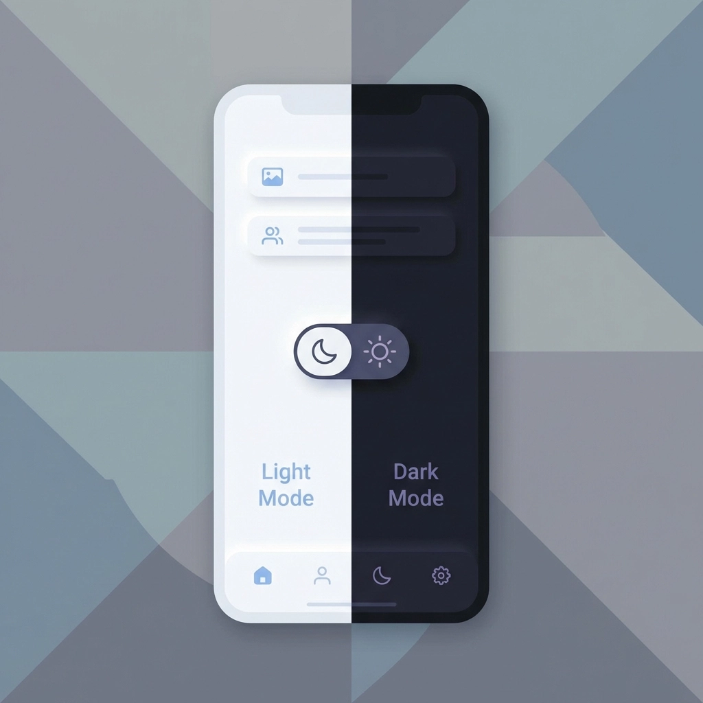
1. Light/Dark Mode Toggle
Users expect control over their browsing experience.
A simple toggle between light and dark modes reduces bounce rates immediately. This feature respects user preferences and demonstrates attention to detail.
Implementation:
- Place toggle in header or settings area
- Remember user preference across sessions
- Ensure all elements remain readable in both modes
- Test contrast ratios for accessibility compliance
Why it works:
Users browsing at night prefer dark mode. Users in bright environments prefer light mode. Forcing one option creates friction. Friction kills conversions.
The toggle signals that your business values visitor comfort. This builds trust before any sales conversation begins.
2. Hover Text for Navigation
Confusion causes task abandonment.
Clear hover text transforms navigation from guessing to guidance. Users understand exactly what each menu item offers before clicking.
Implementation:
- Add descriptive tooltips to navigation items
- Keep text under 10 words
- Display within 200ms of hover
- Position tooltips to avoid blocking other elements
Results from real implementations:
Businesses report significant improvements in user onboarding completion by adding strategic hover text to unclear steps.
Best practices:
| Element | Hover Text Example |
|---|---|
| Services | "View our web design packages" |
| Portfolio | "See completed Venice projects" |
| Contact | "Get a free consultation" |
This eliminates the mental load of interpretation. Users move through your site faster with higher confidence.
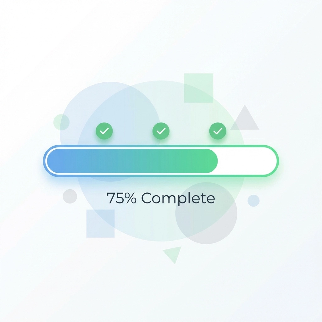
3. Gradient Progress Indicators
Progress bars leverage psychology.
Showing users their advancement toward a goal increases completion rates. This applies to forms, checkouts, surveys, and multi-step processes.
Implementation best practices:
- Use warm color progressions (blues to greens, oranges to reds)
- Animate fills smoothly
- Display specific percentages alongside visuals
- Break complex tasks into achievable steps
Key insight:
Pre-filling progress slightly makes tasks feel more achievable. Starting a progress bar at 10% rather than 0% increases completion likelihood.
Where to apply:
- Checkout processes
- Contact form submissions
- Quote request forms
- Newsletter signup flows
- Account creation steps
Users abandon forms when they cannot estimate time investment. Progress indicators remove this uncertainty.
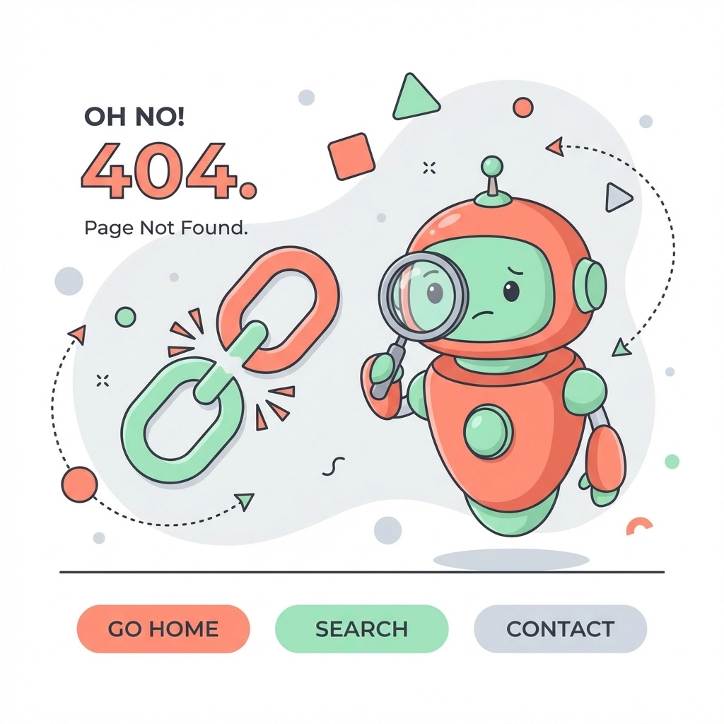
4. Animated 404 Pages
Error pages present opportunity.
Standard 404 pages frustrate users. Animated error pages transform these moments into engagement opportunities.
What works:
- Brand-consistent animations
- Clear explanation of what happened
- Obvious path back to useful content
- Search functionality
- Links to popular pages
Why it matters:
Users who encounter errors judge your entire business by that experience. A thoughtful 404 page signals professionalism. A generic error page signals neglect.
Make error moments memorable for positive reasons. Users remember attention to detail.
Elements to include:
- Animated illustration or graphic
- Friendly, brief error message
- Homepage link
- Search bar
- Contact information
This approach recovers potentially lost visitors instead of losing them permanently.
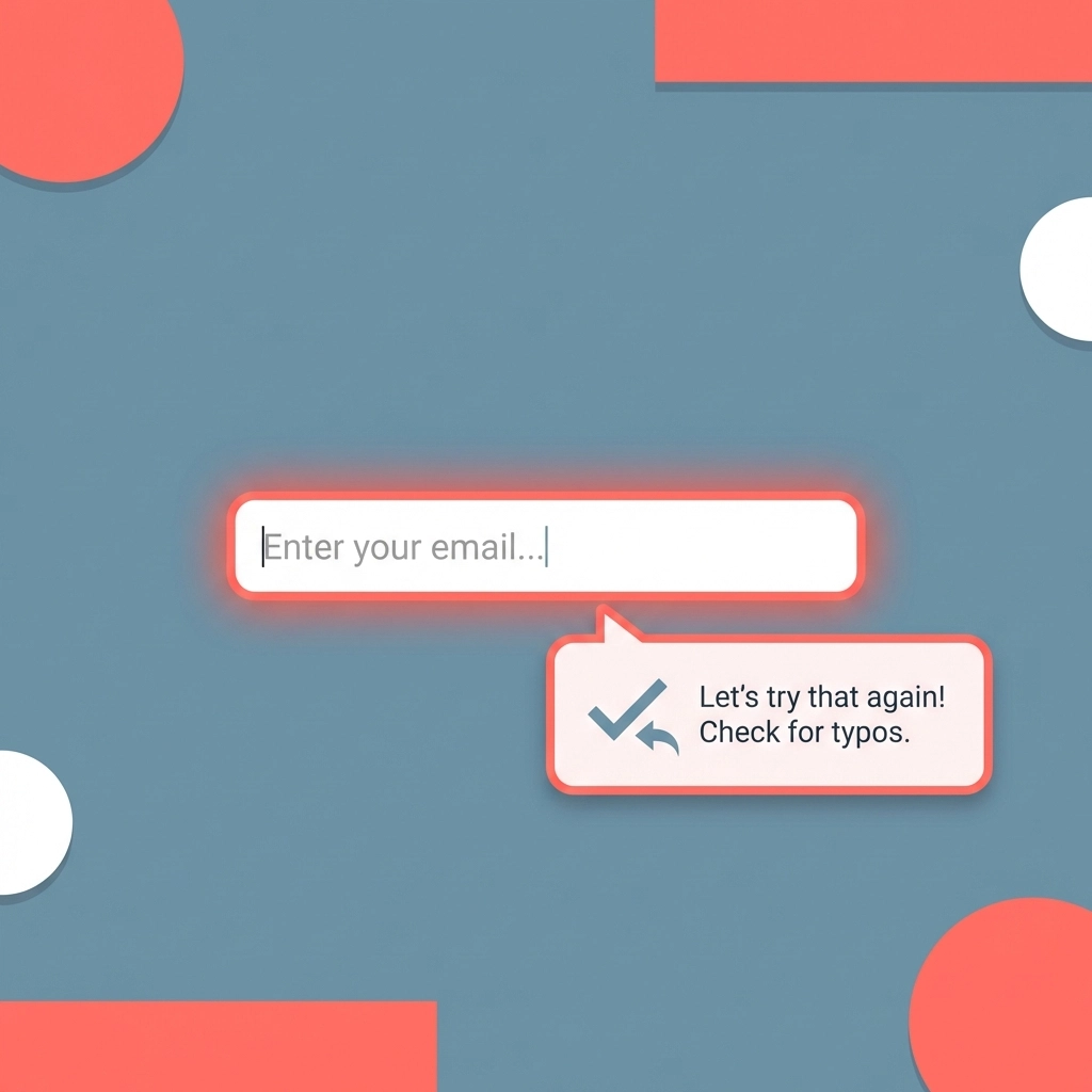
5. Descriptive Error Messages
Cryptic alerts kill conversions.
Strategic error messaging reduces form abandonment and support requests. Guide users toward solutions instead of stating problems.
Bad example:
"Error: Invalid input"
Good example:
"Phone number needs 10 digits. Currently showing 9."
Implementation guidelines:
- Explain what went wrong specifically
- Tell users exactly how to fix it
- Position messages near the problem field
- Use color coding (red for errors, green for success)
- Display in real-time as users type
Impact areas:
This microinteraction decreases friction in critical conversion moments:
- Checkout processes
- Contact form submissions
- Account registrations
- Quote request forms
- Appointment booking systems
Every unclear error message creates a decision point. Users decide whether fixing the problem is worth the effort. Clear guidance removes this decision entirely.
Implementation Strategy
Start with quick wins.
Week 1-2:
- Audit current error messages
- Add hover text to navigation
- Identify forms with high abandonment rates
Week 3-4:
- Implement descriptive error messaging
- Add progress indicators to multi-step forms
- Test dark mode compatibility
Week 5-6:
- Deploy light/dark mode toggle
- Create animated 404 page
- Measure baseline metrics
Measuring Success
Track everything.
Engagement metrics:
- Session duration
- Pages per session
- Scroll depth
- Click-through rates
Conversion metrics:
- Form completion rates
- Checkout completion rates
- Task completion rates
- Bounce rates by page
Business impact:
- Revenue per user
- Customer lifetime value
- Support ticket volume
- Return visitor rates
Compare metrics before and after each implementation. Isolate variables to identify which microinteractions drive the largest improvements.
Common Mistakes
Avoid these implementation errors:
Over-animation:
Too many moving elements distract from content. Use microinteractions sparingly.
Slow response times:
Microinteractions must feel instant. Delays exceeding 100ms feel broken.
Inconsistent styling:
All microinteractions should match brand guidelines. Random styles confuse users.
Missing mobile optimization:
Hover states don't work on mobile. Plan touch alternatives for every hover interaction.
No fallbacks:
Some users disable animations. Ensure functionality remains without visual feedback.
Technical Considerations
Performance matters.
Microinteractions should not slow page load times. Use CSS transitions instead of JavaScript where possible. Optimize animation files for web delivery.
Accessibility requirements:
- Respect reduced motion preferences
- Maintain sufficient color contrast
- Provide alternative text feedback
- Ensure keyboard navigation works
Test across devices and browsers. An interaction that works perfectly on desktop Chrome may fail on mobile Safari.
Next Steps
Audit your current website for microinteraction opportunities.
Identify pages with highest bounce rates. These represent the largest improvement potential.
Start with one implementation. Measure results. Expand based on data.
Small changes compound over time. Each microinteraction improvement increases the likelihood that visitors become customers.
Need help implementing microinteractions on your Venice business website? Venice Florida Web Design specializes in conversion-focused web development for local businesses.
Related reading: Stop Wasting Time on Boring Websites: Try These 7 Interactive Content Hacks That Actually Convert

