

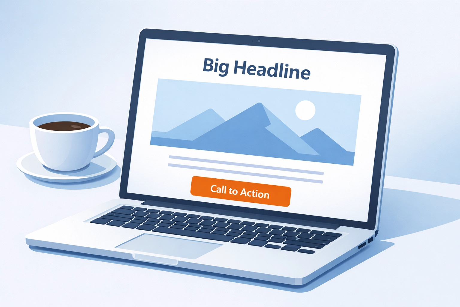
Your landing page has one job: convert visitors into customers.
Not subscribers. Not browsers. Customers.
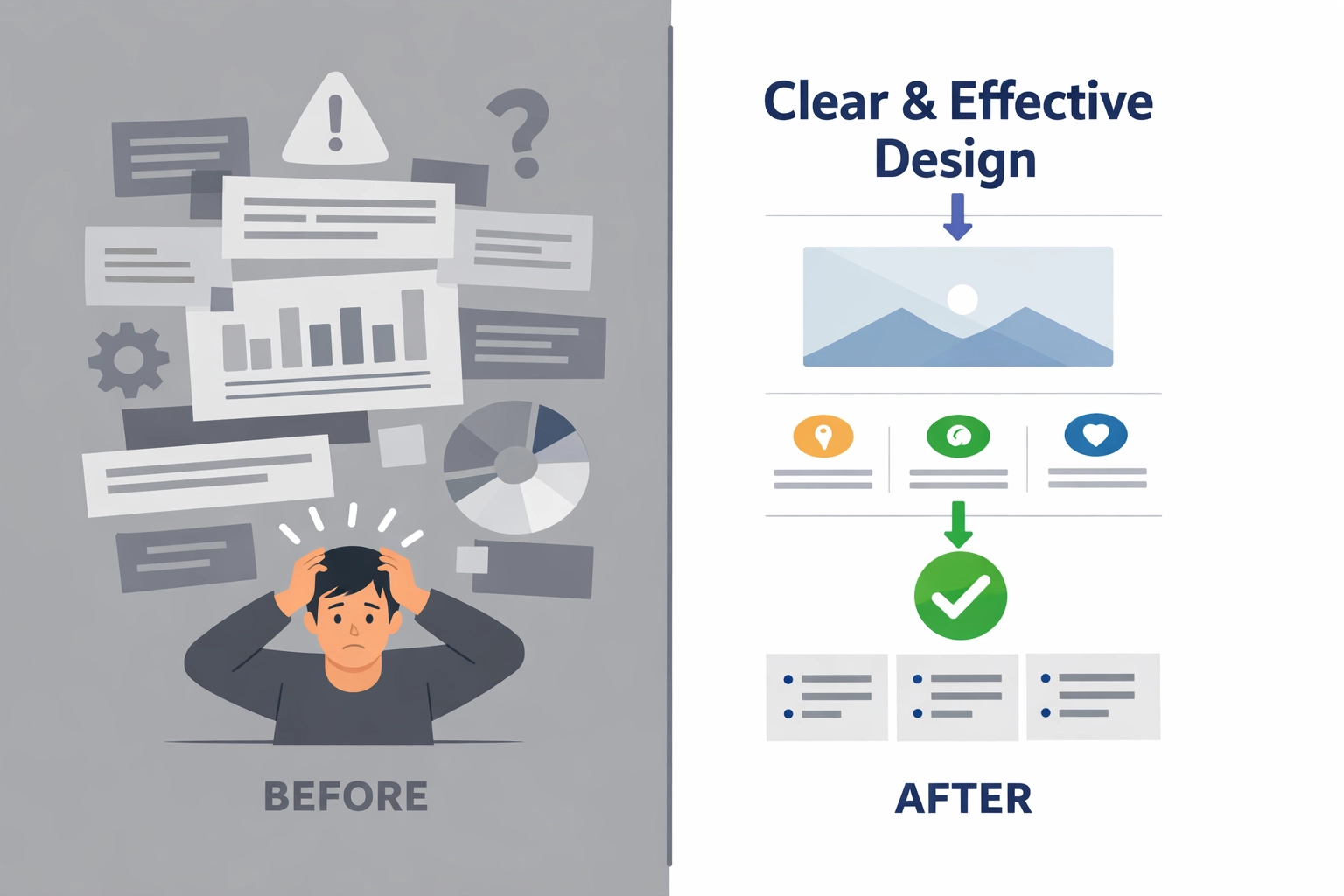
Most Venice web design projects fail because businesses treat landing pages like miniature websites. They pack them with navigation menus, blog links, and enough text to fill a novel. That's the opposite of what works.
A high-converting landing page strips everything down to essentials. Clear message. Single goal. Zero distractions.
Here's exactly what that looks like.
The Headline Does Heavy Lifting
Visitors decide whether to stay or bounce within three seconds.
Your headline answers two questions immediately:
- What is this?
- What's in it for me?
Skip the clever wordplay. State the benefit directly.
Bad: "Innovative Solutions for Modern Businesses"
Good: "Get 10 Qualified Leads Per Week Without Cold Calling"
The second version tells visitors exactly what happens when they work with you. It's specific. Measurable. Relevant.
Place this headline above the fold. That means visible without scrolling on desktop and mobile.
Value Proposition Over Features
People don't buy features. They buy outcomes.
Features: 256-bit encryption, cloud-based storage, automated reporting
Outcomes: Keep customer data secure, access files anywhere, save 5 hours per week
Your value proposition translates technical details into real-world benefits. Focus on how life improves after someone takes action.
For Venice businesses targeting local customers, connect the benefit to their specific situation. A restaurant owner cares about filling tables during off-season. A marina wants boat owners booking slips year-round.
Match your landing page message to what keeps your audience up at night.
Visual Hierarchy Guides the Eye
Single-column layouts convert better than multi-column designs.
The reason: they create a clear path from headline to call-to-action. No competing elements. No decisions about where to look next.
Structure your page in this order:
- Headline
- Subheadline or brief explanation
- Supporting image or video
- Bullet points of key benefits
- Social proof
- Call-to-action
Use whitespace generously. Let each section breathe. Dense blocks of text create friction.
Font weight establishes hierarchy. Your headline should be the boldest element. Subheadings slightly smaller. Body text easily readable without strain.
Copy Addresses Five Core Areas
Effective landing page copy follows a proven structure:
The Problem: What pain point does your audience face?
The Solution: How does your service solve that problem?
The Features: What specific capabilities does your solution include?
The Benefits: How does life improve after implementation?
The Proof: Why should visitors trust you over competitors?
Keep copy scannable. Short paragraphs. Bullet points. Action-oriented language.
Write from the user's perspective. "You get access" not "We provide access."
For Venice web design projects, this might look like:
Problem: Your website isn't generating leads.
Solution: A conversion-focused landing page with clear messaging.
Features: Mobile-responsive design, A/B testing, analytics integration.
Benefits: More qualified leads without increasing ad spend.
Proof: Local businesses seeing 40% higher conversion rates.
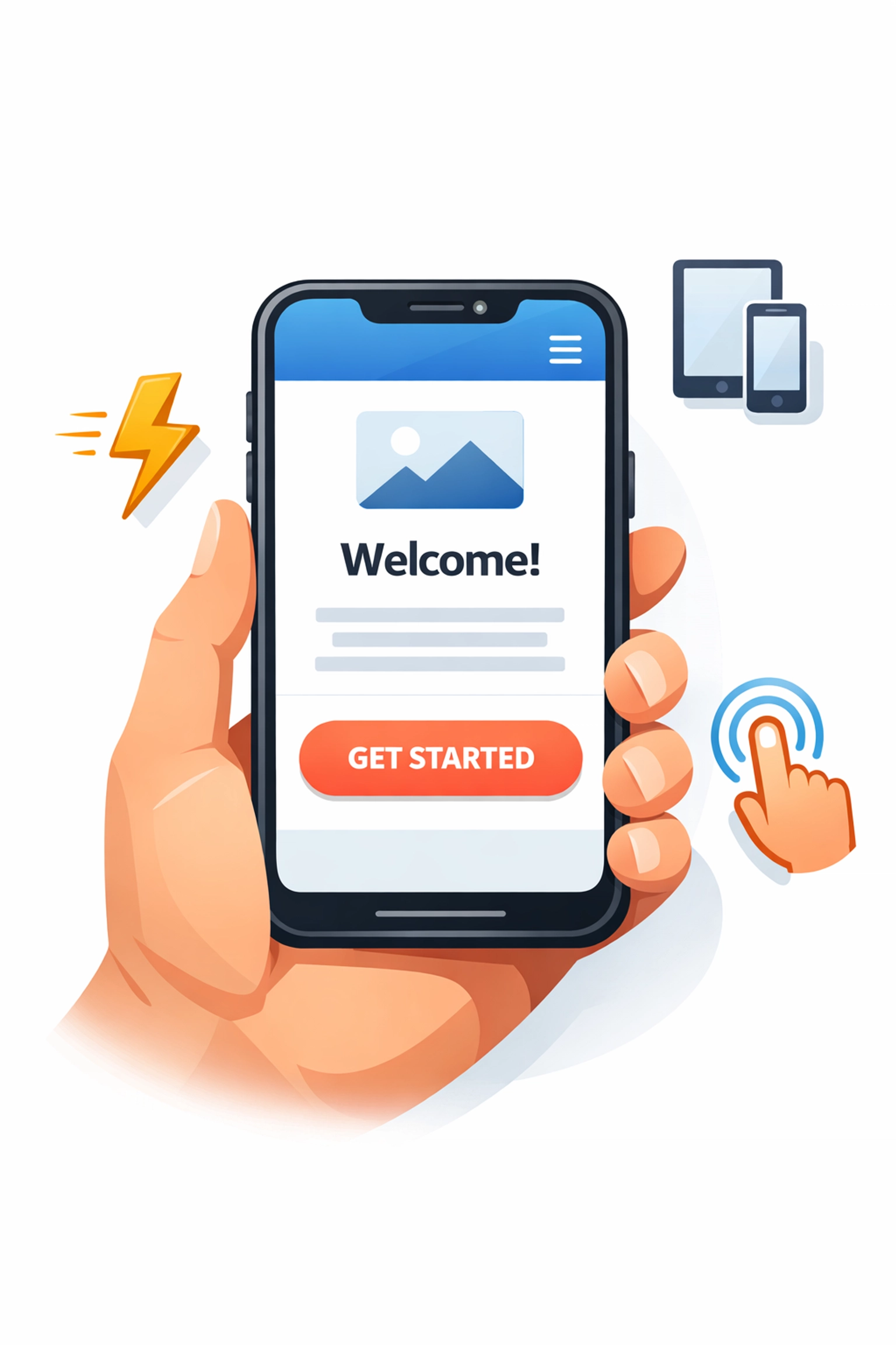
The Call-to-Action Commands Attention
Your CTA button determines whether visitors convert or leave.
Make it unmissable:
- Bold color that contrasts with surrounding elements
- Large enough to click easily on mobile
- Positioned above the fold and at the bottom of the page
- Specific action language
Generic CTAs to avoid:
- Submit
- Click Here
- Learn More
Specific CTAs that convert:
- Schedule Your Free Consultation
- Download the Local SEO Guide
- Get Your Custom Quote
The best CTAs tell visitors exactly what happens next. Remove uncertainty.
Place your strongest CTA above the fold for immediate action. Add another at the bottom for visitors who need more information before committing.
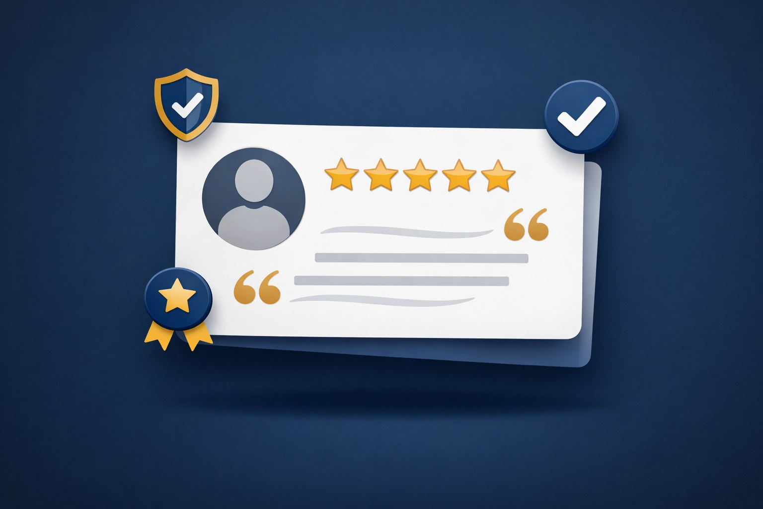
Trust Signals Overcome Hesitation
Social proof turns skeptics into customers.
Include testimonials that provide specific, quantifiable results:
Weak testimonial: "Great service, very professional!"
Strong testimonial: "Venice Florida Web Design increased our online bookings by 60% in 90 days. We went from 3-4 leads per month to 15-20."
Add the person's full name, photo, business name, and title. Generic testimonials without attribution don't build trust.
Position your strongest social proof near the CTA button. That's where last-minute hesitation happens.
Other trust elements that work:
- Client logos from recognizable local businesses
- Industry certifications
- Years in business
- Number of projects completed
- Awards or recognition
For Venice businesses, showcase local success stories. A testimonial from another Venice company carries more weight than one from across the country.
Mobile Optimization Isn't Optional
More than 60% of web traffic comes from mobile devices.
Design for mobile first. Then enhance for desktop.
Mobile optimization requirements:
- Single-column layout
- Large, tappable buttons
- Readable text without zooming
- Fast load times under 3 seconds
- Forms that require minimal typing
Test your landing page on actual mobile devices. Not just in browser emulators. Real iPhone and Android phones with varying screen sizes.
If your CTA button requires precise tapping, it's too small.
Remove Every Distraction
Navigation menus kill conversions.
Each link away from your primary goal gives visitors an escape route. Remove the navbar. Eliminate footer links to other pages. Hide sidebar widgets.
Your landing page should have one conversion path. Everything else is friction.
This applies to forms too. Only ask for information needed to qualify the lead or complete the transaction.
Unnecessary form fields:
- Job title
- Company size
- How did you hear about us?
Essential form fields:
- Name
- Phone (if you'll call them)
Every additional field reduces completion rates. Keep it minimal.
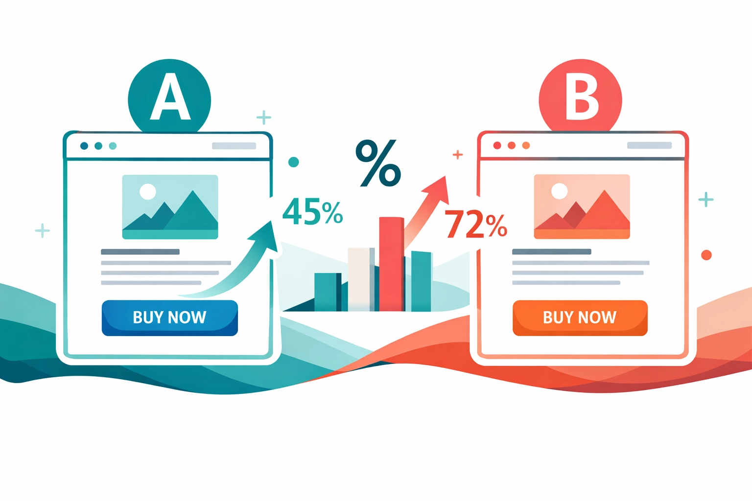
A/B Testing Reveals What Works
Build. Test. Improve. Repeat.
Start with these high-impact tests:
- Headline variations
- CTA button color and copy
- Form length
- Social proof placement
- Hero image vs. video
Test one element at a time. Change the headline in version B while keeping everything else identical to version A.
Run tests for at least two weeks or until you reach statistical significance. A handful of conversions doesn't prove anything.
Track these metrics:
- Conversion rate
- Bounce rate
- Time on page
- Click-through rate on CTA
Small improvements compound. A 20% lift in conversion rate can double your leads over time.
Local Relevance Matters
Generic landing pages underperform.
When targeting Venice customers, incorporate local elements:
- Venice-specific keywords in headlines
- Images of recognizable local landmarks
- Testimonials from Venice businesses
- Address local pain points (seasonal tourism, competition, etc.)
Mention your Venice location explicitly. "Based in Venice" or "Serving Venice businesses since 2015."
Local relevance builds immediate connection. Visitors recognize you understand their specific market challenges.
Final Components
Every high-converting landing page needs:
- Clear headline above the fold
- Benefit-focused value proposition
- Single-column visual hierarchy
- Concise, scannable copy
- Prominent CTA buttons
- Specific testimonials with attribution
- Mobile-first responsive design
- Zero navigation distractions
The difference between a 2% and 10% conversion rate comes down to execution. Not luck. Not magic formulas. Just solid fundamentals applied consistently.
Start with these elements. Test variations. Measure results.
Your landing page becomes a predictable lead generation machine when you remove friction and focus on one clear goal.
Need help building a landing page that actually converts? Schedule a consultation to discuss your specific goals and target audience.